The Shape of Flat Design
We wrote about “flat design” way back in our 2014 Trends book (a lifetime ago in the digital design world) as the hot design trend you’d be seeing more of in the months and years to come. This has proven out, as Apple and Windows have fully embraced it, leaving photorealistic “skeuomorphic” design in the dust.
But nothing ever remains constant in the design realm, and flat design has continued to evolve. Originally there was an almost dogmatic shunning of shading, bevels and other elements that attempted to turn minimalistic flat shapes into objects that had weight and dimension. That rigidity in thought has begun to soften, and we’re seeing those elements start to creep back into designs.
Introducing Flat 2.0
The term “Flat 2.0” is starting to catch on, and it’s a useful descriptor of this trend. Unlike the radical departure of the original flat design, Flat 2.0 is a subtle and fun evolution of the original design trend that shook up the digital world just a couple of years ago.
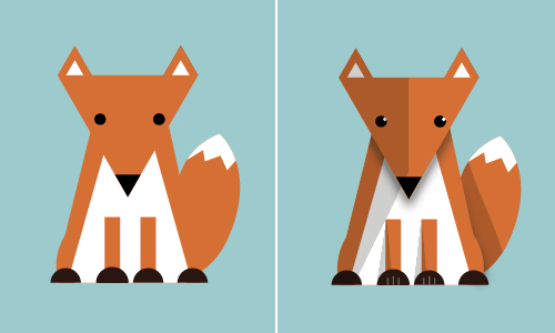
The hallmarks of Flat 2.0 are simple elements that add depth and visual interest to traditional flat design (like the illustration on the opposing page). On the following pages, we’ll illustrate some great examples of Flat 2.0 design in use.
Dangers of Flat 2.0
Flat design, while enthusiastically embraced by the general design community, isn’t without disadvantages. As Flat 2.0 is simply an extension of traditional flat design, those dangers are still present. As with any hot design of the moment, you risk having your website, brochure, business cards or whatnot criticized for “jumping on the bandwagon” and looking like everything else. But perhaps the greatest risk is that flat design is deceptively difficult to execute well. It’s a small step from “simple and streamlined” to “stark and boring.” Make sure you’re making design decisions that enhance your brand and provide an outstanding experience for your clients.
Things to Watch
In addition to the general cautions above, there are three things in particular to watch out for:
Icons as Art
Used correctly, icons add meaning to the experience by simplifying navigation, providing visual cues for content and creating opportunities for fun interactions. However, there’s a misguiding notion that flat design HAS to include icons to be successful. We’ve seen several executions where icons only serve as decorative elements and don’t add any practical value to the overall experience. Before festooning your site with funky icons, ask if they’re really necessary.
Ghost Buttons
Not a danger per se, but for some reason the “ghost button” is starting to emerge as the defining aspect of Flat 2.0 design. Simply stated, a ghost button is an outlined button that may or may not fill with color when you mouse over. That’s it. Executed well, it can be a great addition to the design, but in no way is it required for good Flat 2.0 design.
Going Too Far
This advice goes for any design, of course, but there’s a real temptation to continue to push the gradients, drop shadows, et al. of Flat 2.0 to make the design even more “distinctive” or “fun.” Don’t fall for this trap. Crowding out your beautiful, simple design with excessive reflections, textures, and overly complex icons will only create more visual noise and lessen the overall experience. There’s a reason that design trends moved toward the simple— don’t undo all the work you’ve done to this point.
What’s Next?
As flat design evolves into the more dimensional Flat 2.0, will it eventually return to the starting point: photorealistic things? Probably not. Flat design has proven to be simple to understand and use, especially on mobile platforms. That in particular is likely to cement flat design’s preference for interface design for years to come. However, expect the design to continue to evolve to incorporate more movement, animation and video as users’ attention spans continue to shrink and the demand for content as entertainment continues to grow.
About the Author
About the author::Joe Cola, who sadly has no connection to the world famous brand, Coca-Cola, is the Art Director at thunder::tech. When he isn't designing, Joe loves going to the zoo or the metroparks. He also considers himself a "dinosaur expert."
Contact us today! No pressure, but we are here to help
Reach out to learn more about how thunder::tech can help your business not only succeed, but accelerate.