Plagiarism or parallelism?
Did you see the official logo for the 2020 Tokyo Olympics? Here it is:


Don’t get used to it, though. The Olympic Committee just announced that they are scrapping it and beginning a fresh search. Now, Olympic logos are generally just terrible (see this timeline of progressively worse logos for proof), but the Tokyo logo is being replaced for a different reason: plagiarism. Well, alleged plagiarism.
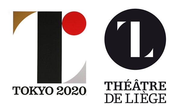
Here’s the Olympic logo developed by designer Kenjiro Sano next to the established logo for the Theatre de Liege in Belgium:
Here’s the Olympic logo developed by designer Kenjiro Sano next to the established logo for the Theatre de Liege in Belgium:
Pretty similar, huh? For the record, Sano denies plagiarizing the design. But looking at the two logos side by side, the evidence seems pretty damning. But is it?
Every graphic designer has, at one time or another, had to defend his or herself against accusations of “stealing” the work of others. At times these allegations turn out to be true (and not to keep piling on Sano, but additional accusations of plagiarism have since been revealed, so it’s not really looking good for him) but at other times it just so happens—believe it or not—that two designers approached a design project the same way and generated similar results.
For example, let’s talk coffee shops. There are some common visual elements the designer or the client might want to include: coffee cups and coffee beans are the obvious choices. In fact, a quick Google image search for “coffee shop logos” gave me these results:
I can hear the copyright lawyer now: “Looking at these logos, are you trying to tell me that three different designers all decided, independently of each other, to create the same style of mug with steam coming out, all in the same perspective and the handle on the same side?”
Yes, that’s exactly what I’m saying.
I’m not implying that any of the coffee shop logos above are plagiarized (I’m sure they weren’t), but this is a great example of “parallelism,” where different designers come up with similar creative solutions. This is especially rampant in industries that have obvious visual metaphors: lawyers = scales of justice, apartment buildings = building façade, plumbers = leaky faucets, etc., etc., etc.
Now, you can say this is lazy design to go with the obvious, and I would agree with you. But lazy design does not equal plagiarism.
So, what do you think? When it comes to the Tokyo logo, is it plagiarism or parallelism? Let us know at info@thundertech.com.
Related Blog & News
Contact us today! No pressure, but we are here to help
Reach out to learn more about how thunder::tech can help your business not only succeed, but accelerate.